
web design, development, support

Most of the websites we've designed which are currently active are listed below in rough chronological order with the most recent first.
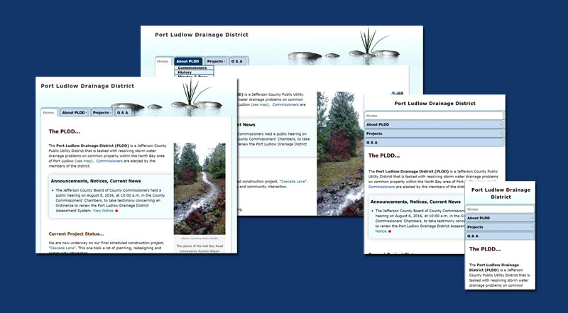
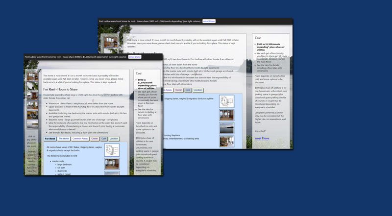
This site was recently redone and looks completely different than these screenshots.... it is an elegant example of how an informational site can be organized to make it easy to use, and on how this kind of site can still be visually interesting even though the content is pretty dry... you have to see it to appreciate it, take a look... www.pldd.org
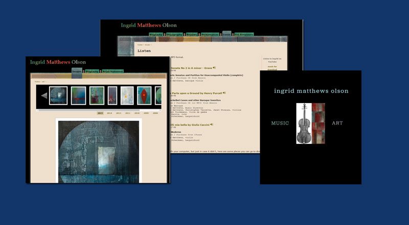
This site is another that has been redone and no longer matches these screenshots. It is a beautiful example of how much some changes the CSS can change the look of a website ... you have to see it to appreciate it, take a look... www.ingridmatthews.com
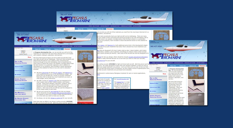
Cetacean Research Technology specializes in underwater acoustic instrumentation that is tailored for their clients' applications. The website presents and promotes their hydrophone systems & other products, and helps answer common questions from customers.
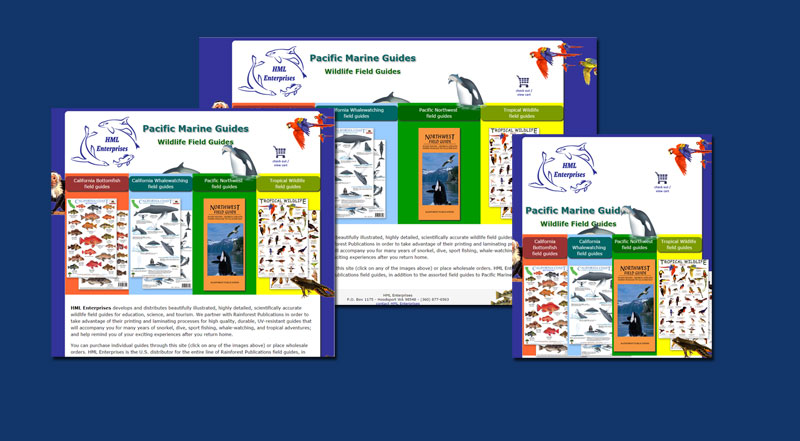
Rainforest Publications uses their website to sell the field guides they design and manufacture. The site serves as a reference for distributors & potential clients for custom field guides, and offers direct online sales to the public.
Marine-Med.com is the website of Dr. Stephanie Norman, our local Pacific NW whale doc... . marine-med.com recently received a technical update but we haven't updated the screenshots yet...
A Fine Design
A Fine Design's website is a beautiful example of close collaboration between the owners and Artemis Computing. In this case, because the owners are experienced and are designers themselves, and they did most of the content development by themselves, it also saved them a bundle.
the Hair Studio
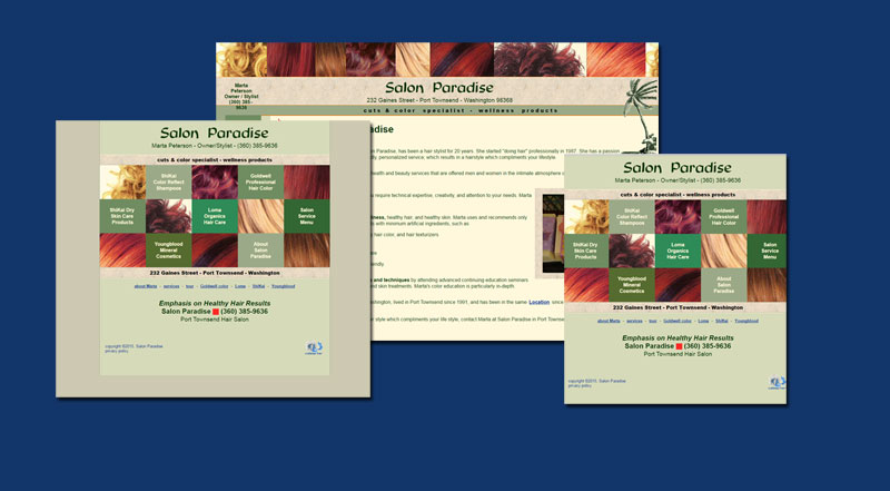
the Hair Studio's website is a nice example of how a simple site can be interesting to both people and bots
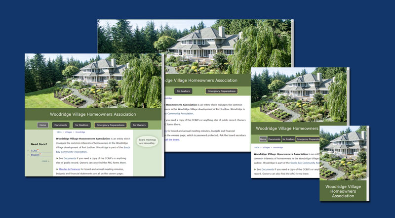
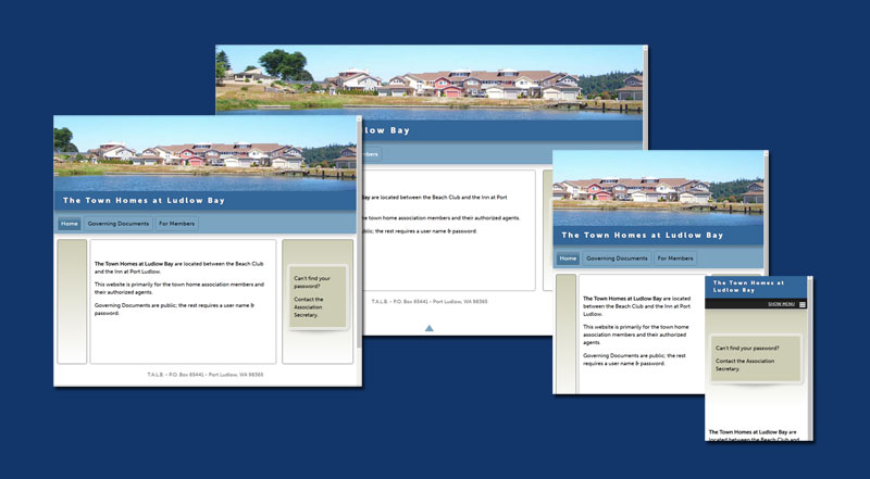
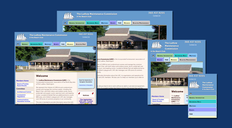
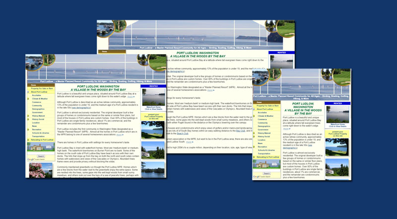
A mostly private site for a homeowners association. If you are trying to decide how you want the banner on your site to behavemore...![]() , this is a good example site to look at. In this case, it is always the same height so the photo is always the same size. As the screen size gets smaller, the photo is cropped; in this case, from the sides.
, this is a good example site to look at. In this case, it is always the same height so the photo is always the same size. As the screen size gets smaller, the photo is cropped; in this case, from the sides.![]()
To say I am excited is to put it mildly. A lot was learned but in the end we have the best homeowner website at SBCA and all thanks to you. The big lesson for me is how important it is that all the documents we put together are clearly identified so they are more easily catalogued.
~ Mike P.
Smokey Point Massage
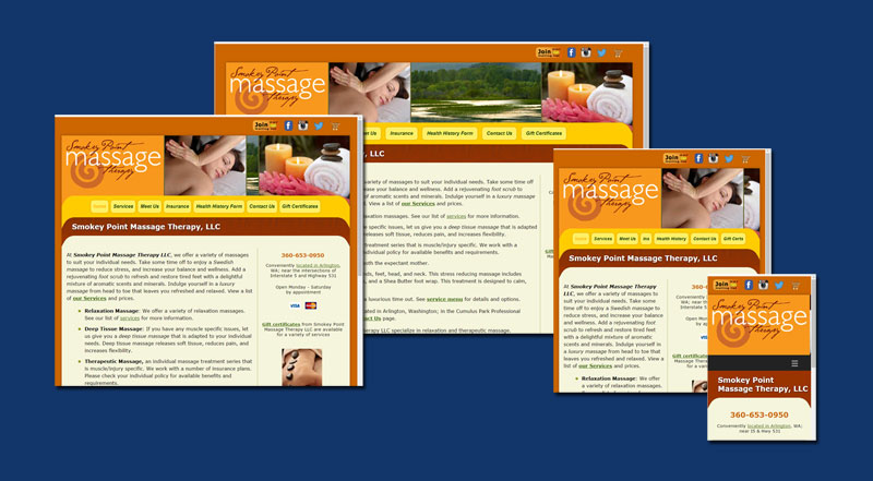
Smokey Point Massage Therapy LLC's website is a great example of a successful site created developed from the client's pre-existing marketing materials
Thank you Diane for creating a beautiful and efficient website for me.
Your attention to detail, professionalism, willingness to explain different options and ideas made the process easy and understandable.
I'm enjoying the success of your creative efforts, thank you once again.
~ Janae
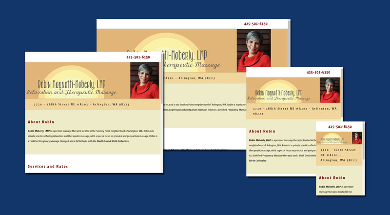
Robin's site is a nice example of a design primarily aimed at clients with tablets and mobile devices. It is a fairly new one-page website designed to give Robin's clients an easy reference for contacting her and to establish her position on the web as an independent. She has been working exclusively with collectives for many years and has decided to expand her practice and also work independently.
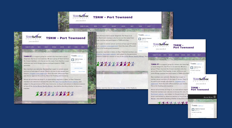
This is a deceptively simple one page site. The design is primarily for mobile and tablet but it isn't "mobile-first" because it doesn't overpower folks with laptops or wide screens. See what it looks like on an iphone using Responsinator.
www.inbalancebodywork.com
www.inbalancetherapeuticmassage.com
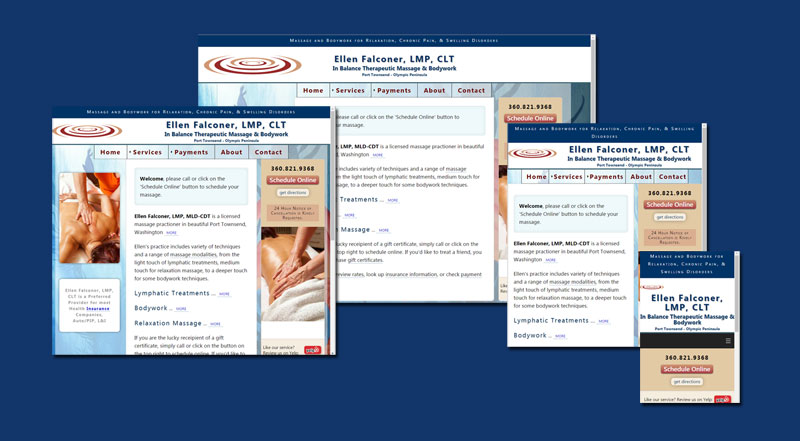
This is another beautiful example of a site created to compliment the owner's marketing materials, skills, and location. It has a lot of custom adjustments for screen sizes, both visually and contextually.
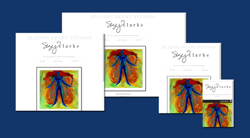
Suzy creates gorgeous, colorful paintings that make us feel good. Her site is visually simple so that it doesn't distract from her work. We still managed to add a few embelishments. She says that's why she like our work; it's a little different from everyone else.
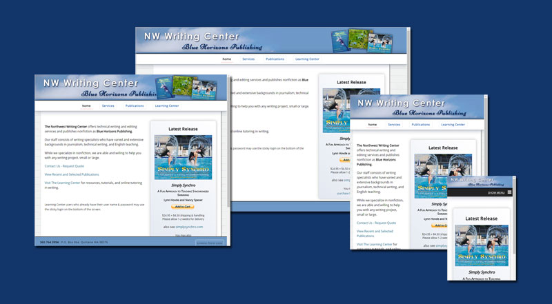
www.bluehorizonspublishing.com
www.nwwritingcenter.com
One of the interesting, technical things, about how this site is set up is that it really is multiple sites in one. Using some settings that are complicated to explain in words, it demonstrates how we can help entrepreneurs with multiple businesses maximize their web budget and still keep things completely separate...
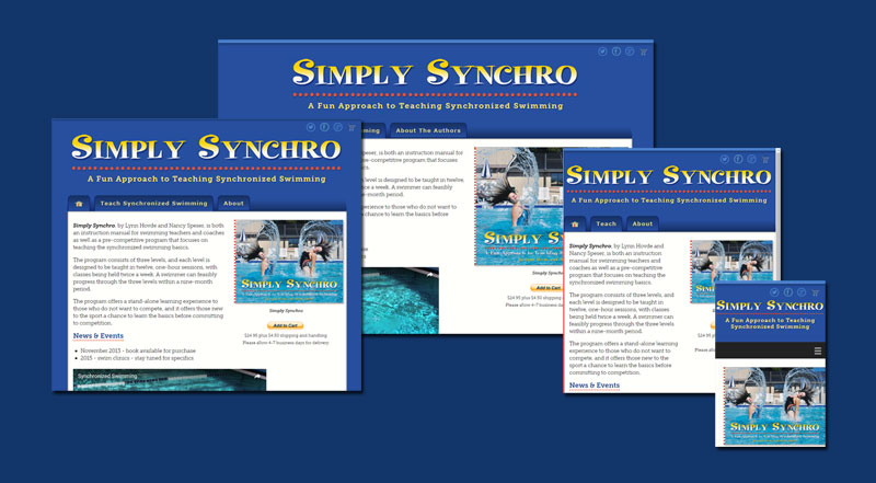
This site is both connected to the Blue Horizons family and is separate.
In addition to the unique setup for combining hosting (and still keeping sites separate), something technically interesting about this site is that there is a matching blog, which is hidden as of this writing.
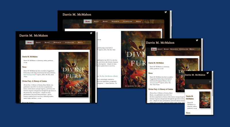
This is a gorgeous, interesting site. It was designed to accompany the book which is featured on the home page.
The site is modern and fully responsive, and includes a couple interesting features to help organize the presentation.
If you are looking for an interesting Twitter feed to follow, you might be interested in Darrin's account. You can follow the link from the little tweety bird in the upper right.
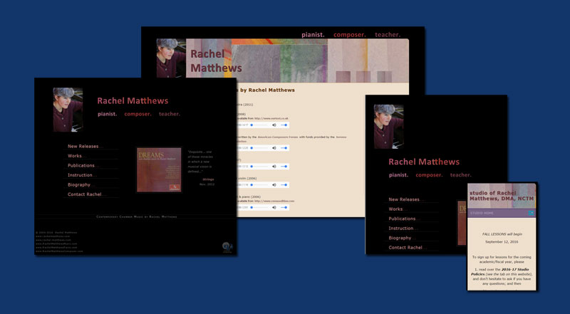
Rachel Matthew's site has two parts, public pages and a private section for her Piano Studio which was added later. This is an interesting site from a technical point of view because it combines multiple technologies: WordPress for the private studio pages and custom HTML for the public pages.
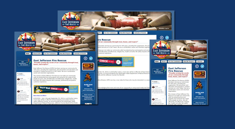
The East Jefferson Fire Rescue website is one of their important communication channels. The pages are rich with content including high quality photography. The design is colorful, with lots of detail. It's very flexible but not quite responsive, however it's another one of the sites that is easy to update incrementally, and we've been doing that.
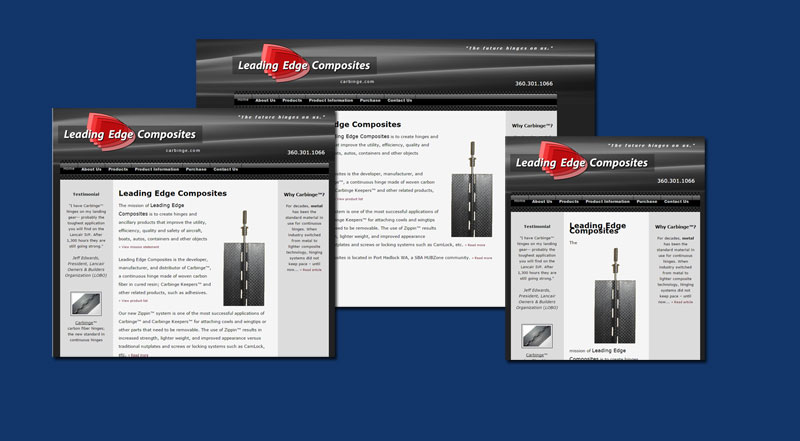
Something interesting and fun about the visual design for the Carbinge website is that it was created from photos of the products. The top is a crop of a carbinge hinge and the bottom trim is made of pins.
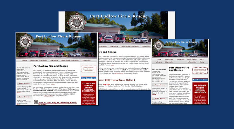
The PLF&R website is an evolving site; originally redesigned approx 2008, with incremental updates in the interim. It's a great example of a design and code that is well engineered to be adaptable to changes.
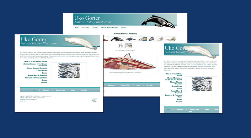
Diane is an expert website developer and designer. Her patience, skill, and understanding of client needs are unique. I absolutely recommend the services of Artemis Computing to anyone!
~ Uko
"Thanks for doing such a great job on the website.
The best part was your ability to take information in, sort it, then assemble it into a logical and readable format.
Your work with the vast amount of information you were given and somehow making it understandable was excellent!
Thank you so much for all your hard work! Your help and guidance were really appreciated and made the process much easier."
Dan Newland
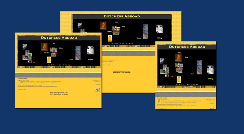
"I worked very hard yesterday to get an application for a Hedgebrook residency out on time. There was room to note which alumnae I knew personally and scanning the list on the website of Hedgebrook I noticed Rene Yung. I wasn't sure if that was the Rene I knew, so I Googled her. Guess What? The first link that popped up was one of my International Examiner articles!
Tagging right is a gift that keeps on giving. Thank you!"
~Judith van Praag
The easiest way to connect is via email. Our 'Contact' page has a handy form for sending Diane a message plus details for additional ways to connect.
We'd love to hear from you.
Usually the easiest way to connect is via email. Use the following form to send a message.
* indicates required fields (there are only two)
If you are looking for help with the contact form, how about calling instead?